class: center, middle, inverse, title-slide .title[ # Hands-on Exercise 4: Visual Analytics with R ] .author[ ### Dr. Kam Tin Seong<br/>Assoc. Professor of Information Systems ] .institute[ ### School of Computing and Information Systems,<br/>Singapore Management University ] .date[ ### 2020-2-15 (updated: 2022-05-08) ] --- ## Learning Outcome .vlarge[ In this hands-on exercise, you will gain hands-on experience on using: + ggstatsplot to create visual graphics with rich statistical information, + ggdist to visualise uncertainty on data, and + ungeviz to build hypothetical outcome plots (HOPs). ] --- # Getting Started In this exercise, **infer**, **ggstatsplot** and **tidyverse** will be used. ```r packages = c('ggstatsplot', 'ggside', 'knitr', 'tidyverse', 'broom', 'ggdist', 'ungeviz', 'gganimate', 'plotly', 'crosstalk', 'DT') for (p in packages){ if(!require(p, character.only = T)){ install.packages(p) } } ``` In this exercise, the Exam.csv data will be used. ```r exam <- read_csv("data/Exam_data.csv") ``` --- ## Visual Statistical Analysis with **ggstatsplot**  .large[ + [**ggstatsplot**](https://indrajeetpatil.github.io/ggstatsplot/index.html) is an extension of [**ggplot2**](https://ggplot2.tidyverse.org/) package for creating graphics with details from statistical tests included in the information-rich plots themselves. + To provide alternative statistical inference methods by default. + To follow best practices for statistical reporting. For all statistical tests reported in the plots, the default template abides by the [APA](https://my.ilstu.edu/~jhkahn/apastats.html) gold standard for statistical reporting. For example, here are results from a robust t-test: .center[ ] ] --- ### One-sample test: *gghistostats()* method .pull-left[ In the code chunk below, [*gghistostats()*](https://indrajeetpatil.github.io/ggstatsplot/reference/gghistostats.html) is used to to build an visual of one-sample test on English scores. ```r set.seed(1234) gghistostats( data = exam, x = ENGLISH, type = "bayes", test.value = 60, xlab = "English scores" ) ``` Default information: - statistical details - Bayes Factor - sample sizes - distribution summary ] .pull-right[ <img src="Hands-on_Ex04_files/figure-html/unnamed-chunk-4-1.png" width="504" /> ] --- ### Unpacking the Bayes Factor - A Bayes factor is the ratio of the likelihood of one particular hypothesis to the likelihood of another. It can be interpreted as a measure of the strength of evidence in favor of one theory among two competing theories. - That’s because the Bayes factor gives us a way to evaluate the data in favor of a null hypothesis, and to use external information to do so. It tells us what the weight of the evidence is in favor of a given hypothesis. - When we are comparing two hypotheses, H1 (the alternate hypothesis) and H0 (the null hypothesis), the Bayes Factor is often written as B10. It can be defined mathematically as .center[ ] - The [**Schwarz criterion**](https://www.statisticshowto.com/bayesian-information-criterion/) is one of the easiest ways to calculate rough approximation of the Bayes Factor. --- ### How to interpret Bayes Factor A **Bayes Factor** can be any positive number. One of the most common interpretations is this one—first proposed by Harold Jeffereys (1961) and slightly modified by [Lee and Wagenmakers](https://www-tandfonline-com.libproxy.smu.edu.sg/doi/pdf/10.1080/00031305.1999.10474443?needAccess=true) in 2013: .center[ ] --- ### Two-sample mean test: *ggbetweenstats()* .pull-left[ In the code chunk below, [*ggbetweenstats()*](https://indrajeetpatil.github.io/ggstatsplot/reference/ggbetweenstats.html) is used to build a visual for two-sample mean test of Maths scores by gender. ```r ggbetweenstats( data = exam, x = GENDER, y = MATHS, type = "np", messages = FALSE ) ``` Default information: - statistical details - Bayes Factor - sample sizes - distribution summary ] .pull-right[ <img src="Hands-on_Ex04_files/figure-html/unnamed-chunk-6-1.png" width="504" /> ] --- ### Oneway ANOVA Test: *ggbetweenstats()* method .pull-left[ In the code chunk below, [*ggbetweenstats()*](https://indrajeetpatil.github.io/ggstatsplot/reference/ggbetweenstats.html) is used to build a visual for One-way ANOVA test on English score by race. ```r ggbetweenstats( data = exam, x = RACE, y = ENGLISH, type = "p", mean.ci = TRUE, pairwise.comparisons = TRUE, pairwise.display = "s", p.adjust.method = "fdr", messages = FALSE ) ``` - "ns" → only non-significant - "s" → only significant - "all" → everything ] .pull-right[ <img src="Hands-on_Ex04_files/figure-html/unnamed-chunk-8-1.png" width="504" /> ] --- ## ggbetweenstats - Summary of tests .center[ ] --- ## ggbetweenstats - Summary of tests .center[ ] --- ## ggbetweenstats - Summary of tests .center[ ] --- ### Significant Test of Correlation: *ggscatterstats()* .pull-left[ In the code chunk below, [*ggscatterstats()*](https://indrajeetpatil.github.io/ggstatsplot/reference/ggscatterstats.html) is used to build a visual for Significant Test of Correlation between Maths scores and English scores. ```r ggscatterstats( data = exam, x = MATHS, y = ENGLISH, marginal = FALSE, ) ``` ] .pull-right[ <img src="Hands-on_Ex04_files/figure-html/unnamed-chunk-10-1.png" width="504" /> ] --- ### Significant Test of Association (Depedence) : *ggbarstats()* methods .pull-left[ In the code chunk below, the Maths scores is binned into a 4-class variable by using [*cut()*](https://www.rdocumentation.org/packages/base/versions/3.6.2/topics/cut). ```r exam1 <- exam %>% mutate(MATHS_bins = cut(MATHS, breaks = c(0,60,75,85,100)) ) ``` In this code chunk below [*ggbarstats()*](https://indrajeetpatil.github.io/ggstatsplot/reference/ggbarstats.html) is used to build a visual for Significant Test of Association ```r ggbarstats(exam1, x = MATHS_bins, y = GENDER) ``` ] .pull-right[ <img src="Hands-on_Ex04_files/figure-html/unnamed-chunk-13-1.png" width="504" /> ] --- ## Toyota Corolla case study .pull-left[ .large[ + Build a model to discover factors affecting prices of used-cars by taking into consideration a set of explanatory variables. ]] .pull-right[  ] --- ## Installing and loading the required libraries .large[ Type the code chunk below to install and launch the necessary R packages ] ```r packages = c('readxl', 'report', 'performance', 'parameters', 'see') for(p in packages){ if(!require(p, character.only = T)){ install.packages(p) } library(p, character.only = T) } ``` --- ## Importing Excel file: readxl methods  In the code chunk below, [*read_xls()*](https://readxl.tidyverse.org/reference/read_excel.html) of [**readxl**](https://readxl.tidyverse.org/) package is used to import the data worksheet of `ToyotaCorolla.xls` workbook into R. ```r car_resale <- read_xls("data/ToyotaCorolla.xls", "data") ``` Notice that the output object `car_resale` is a tibble data frame. --- ## Multiple Regression Model using lm() The code chunk below is used to calibrate a multiple linear regression model by using *lm()* of Base Stats of R. ```r model <- lm(Price ~ Age_08_04 + Mfg_Year + KM + Weight + Guarantee_Period, data = car_resale) model ``` ``` ## ## Call: ## lm(formula = Price ~ Age_08_04 + Mfg_Year + KM + Weight + Guarantee_Period, ## data = car_resale) ## ## Coefficients: ## (Intercept) Age_08_04 Mfg_Year KM ## -2.637e+06 -1.409e+01 1.315e+03 -2.323e-02 ## Weight Guarantee_Period ## 1.903e+01 2.770e+01 ``` --- ## Model Diagnostic: checking for multicolinearity: In the code chunk, [*check_collinearity()*](https://easystats.github.io/performance/reference/check_collinearity.html) of [**performance**](https://easystats.github.io/performance/index.html) package. .pull-left[ ```r check_collinearity(model) ``` ``` ## # Check for Multicollinearity ## ## Low Correlation ## ## Term VIF Increased SE Tolerance ## KM 1.46 1.21 0.68 ## Weight 1.41 1.19 0.71 ## Guarantee_Period 1.04 1.02 0.97 ## ## High Correlation ## ## Term VIF Increased SE Tolerance ## Age_08_04 31.07 5.57 0.03 ## Mfg_Year 31.16 5.58 0.03 ``` ] -- .pull-right[ ```r check_c <- check_collinearity(model) plot(check_c) ``` <img src="Hands-on_Ex04_files/figure-html/unnamed-chunk-18-1.png" width="504" /> ] --- ## Model Diagnostic: checking normality assumption .pull-left[ In the code chunk, [*check_normality()*](https://easystats.github.io/performance/reference/check_normality.html) of [**performance**](https://easystats.github.io/performance/index.html) package. ```r check_n <- check_normality(model1) ``` ] .pull-right[ ```r plot(check_n) ``` <img src="Hands-on_Ex04_files/figure-html/unnamed-chunk-21-1.png" width="504" /> ] --- ## Model Diagnostic: Check model for homogeneity of variances .pull-left[ In the code chunk, [*check_heteroscedasticity()*](https://easystats.github.io/performance/reference/check_heteroscedasticity.html) of [**performance**](https://easystats.github.io/performance/index.html) package. ```r check_h <- check_heteroscedasticity(model1) ``` ] .pull-right[ ```r plot(check_h) ``` <img src="Hands-on_Ex04_files/figure-html/unnamed-chunk-23-1.png" width="504" /> ] --- ## Model Diagnostic: Complete check We can also perform the complete by using [*check_model()*](https://easystats.github.io/performance/reference/check_model.html). ```r check_model(model1) ``` <img src="Hands-on_Ex04_files/figure-html/unnamed-chunk-24-1.png" width="864" /> --- ### Visualising Regression Parameters: see methods .pull-left[ In the code below, plot() of see package and parameters() of parameters package is used to visualise the parameters of a regression model. ```r plot(parameters(model1)) ``` ] .pull-left[ <img src="Hands-on_Ex04_files/figure-html/unnamed-chunk-26-1.png" width="504" /> ] --- ### Visualising Regression Parameters: *ggcoefstats()* methods .pull-left[ In the code below, [*ggcoefstats()*](https://indrajeetpatil.github.io/ggstatsplot/reference/ggcoefstats.html) of ggstatsplot package to visualise the parameters of a regression model. ```r ggcoefstats(model1, output = "plot") ``` ] .pull-left[ <img src="Hands-on_Ex04_files/figure-html/unnamed-chunk-28-1.png" width="504" /> ] --- ## Visualizing the uncertainty of point estimates .pull-left[ .large[ + A point estimate is a single number, such as a mean. + Uncertainty is expressed as standard error, confidence interval, or credible interval + Important: + Don't confuse the uncertainty of a point estimate with the variation in the sample ]] --- ### Visualizing the uncertainty of point estimates: ggplot2 methods .pull-left[ The code chunk below performs the followings: - group the observation by RACE, - computes the count of observations, mean, standard deviation and standard error of Maths by RACE, and - save the output as a tibble data table called `my_sum`. ```r my_sum <- exam %>% group_by(RACE) %>% summarise( n=n(), mean=mean(MATHS), sd=sd(MATHS) ) %>% mutate(se=sd/sqrt(n-1)) ``` Note: For the mathematical explanation, please refer to Slide 20 of Lesson 4. ] -- .pull-right[ Next, the code chunk below will ```r knitr::kable(head(my_sum), format = 'html') ``` <table> <thead> <tr> <th style="text-align:left;"> RACE </th> <th style="text-align:right;"> n </th> <th style="text-align:right;"> mean </th> <th style="text-align:right;"> sd </th> <th style="text-align:right;"> se </th> </tr> </thead> <tbody> <tr> <td style="text-align:left;"> Chinese </td> <td style="text-align:right;"> 193 </td> <td style="text-align:right;"> 76.50777 </td> <td style="text-align:right;"> 15.69040 </td> <td style="text-align:right;"> 1.132357 </td> </tr> <tr> <td style="text-align:left;"> Indian </td> <td style="text-align:right;"> 12 </td> <td style="text-align:right;"> 60.66667 </td> <td style="text-align:right;"> 23.35237 </td> <td style="text-align:right;"> 7.041005 </td> </tr> <tr> <td style="text-align:left;"> Malay </td> <td style="text-align:right;"> 108 </td> <td style="text-align:right;"> 57.44444 </td> <td style="text-align:right;"> 21.13478 </td> <td style="text-align:right;"> 2.043177 </td> </tr> <tr> <td style="text-align:left;"> Others </td> <td style="text-align:right;"> 9 </td> <td style="text-align:right;"> 69.66667 </td> <td style="text-align:right;"> 10.72381 </td> <td style="text-align:right;"> 3.791438 </td> </tr> </tbody> </table> ] --- ### Visualizing the uncertainty of point estimates: ggplot2 methods .pull-left[ The code chunk below is used to reveal the standard error of mean maths score by race. ```r ggplot(my_sum) + geom_errorbar( aes(x=RACE, ymin=mean-se, ymax=mean+se), width=0.2, colour="black", alpha=0.9, size=0.5) + geom_point(aes (x=RACE, y=mean), stat="identity", color="red", size = 1.5, alpha=1) + ggtitle("Standard error of mean maths score by rac") ``` ] .pull-right[ <img src="Hands-on_Ex04_files/figure-html/unnamed-chunk-32-1.png" width="504" /> ] --- ### Visualizing the uncertainty of point estimates: **ggplot2** methods .pull-left[ **Exercise:** Plot the 95% confidence interval of mean maths score by race. The error bars should be sorted by the average maths scores. ```r ggplot(my_sum) + geom_errorbar( aes(x=reorder(RACE, -mean), * ymin=mean-1.96*se, * ymax=mean+1.96*se), width=0.2, colour="black", alpha=0.9, size=0.5) + geom_point(aes (x=RACE, y=mean), stat="identity", color="red", size = 1.5, alpha=1) + ggtitle("95% confidence interval of mean maths score by race") ``` ] .pull-right[ The solution: <img src="Hands-on_Ex04_files/figure-html/unnamed-chunk-34-1.png" width="504" /> ] --- ### Visualizing the uncertainty of point estimates with interactive error bars **Exercise:** Plot interactive error bars for the 99% confidence interval of mean maths score by race. <div class="container-fluid crosstalk-bscols"> <div class="row"> <div class="col-xs-4"> <div id="htmlwidget-34f3ae01fdc619ca916c" style="width:100%;height:400px;" class="plotly html-widget"></div> <script type="application/json" data-for="htmlwidget-34f3ae01fdc619ca916c">{"x":{"data":[{"x":[1,3,4,2],"y":[76.5077720207254,60.6666666666667,57.4444444444444,69.6666666666667],"text":"","key":["1","2","3","4"],"type":"scatter","mode":"lines","opacity":0.9,"line":{"color":"transparent"},"error_y":{"array":[2.92148180332821,18.1657940296391,5.2713960499886,9.78190932282649],"arrayminus":[2.92148180332821,18.1657940296391,5.2713960499886,9.7819093228265],"type":"data","width":24,"symmetric":false,"color":"rgba(0,0,0,1)"},"set":"SharedDataab867f26","showlegend":false,"xaxis":"x","yaxis":"y","hoverinfo":"text","_isNestedKey":false,"frame":null},{"x":[1,3,4,2],"y":[76.5077720207254,60.6666666666667,57.4444444444444,69.6666666666667],"text":["Race: Chinese <br>N: 193 <br>Avg. Scores: 76.51 <br>95% CI:[ 73.59 , 79.43 ]","Race: Indian <br>N: 12 <br>Avg. Scores: 60.67 <br>95% CI:[ 42.5 , 78.83 ]","Race: Malay <br>N: 108 <br>Avg. Scores: 57.44 <br>95% CI:[ 52.17 , 62.72 ]","Race: Others <br>N: 9 <br>Avg. Scores: 69.67 <br>95% CI:[ 59.88 , 79.45 ]"],"key":["1","2","3","4"],"type":"scatter","mode":"markers","marker":{"autocolorscale":false,"color":"rgba(255,0,0,1)","opacity":1,"size":5.66929133858268,"symbol":"circle","line":{"width":1.88976377952756,"color":"rgba(255,0,0,1)"}},"hoveron":"points","set":"SharedDataab867f26","showlegend":false,"xaxis":"x","yaxis":"y","hoverinfo":"text","_isNestedKey":false,"frame":null}],"layout":{"margin":{"t":40.8401826484018,"r":7.30593607305936,"b":47.9234443446851,"l":37.2602739726027},"font":{"color":"rgba(0,0,0,1)","family":"","size":14.6118721461187},"title":{"text":"99% Confidence interval of average /<br>maths scores by race","font":{"color":"rgba(0,0,0,1)","family":"","size":17.5342465753425},"x":0,"xref":"paper"},"xaxis":{"domain":[0,1],"automargin":true,"type":"linear","autorange":false,"range":[0.4,4.6],"tickmode":"array","ticktext":["Chinese","Others","Indian","Malay"],"tickvals":[1,2,3,4],"categoryorder":"array","categoryarray":["Chinese","Others","Indian","Malay"],"nticks":null,"ticks":"","tickcolor":null,"ticklen":3.65296803652968,"tickwidth":0,"showticklabels":true,"tickfont":{"color":"rgba(77,77,77,1)","family":"","size":11.689497716895},"tickangle":-45,"showline":false,"linecolor":null,"linewidth":0,"showgrid":true,"gridcolor":"rgba(235,235,235,1)","gridwidth":0.66417600664176,"zeroline":false,"anchor":"y","title":{"text":"Race","font":{"color":"rgba(0,0,0,1)","family":"","size":14.6118721461187}},"hoverformat":".2f"},"yaxis":{"domain":[0,1],"automargin":true,"type":"linear","autorange":false,"range":[40.6534874694042,81.2959611571165],"tickmode":"array","ticktext":["50","60","70","80"],"tickvals":[50,60,70,80],"categoryorder":"array","categoryarray":["50","60","70","80"],"nticks":null,"ticks":"","tickcolor":null,"ticklen":3.65296803652968,"tickwidth":0,"showticklabels":true,"tickfont":{"color":"rgba(77,77,77,1)","family":"","size":11.689497716895},"tickangle":-0,"showline":false,"linecolor":null,"linewidth":0,"showgrid":true,"gridcolor":"rgba(235,235,235,1)","gridwidth":0.66417600664176,"zeroline":false,"anchor":"x","title":{"text":"Average Scores","font":{"color":"rgba(0,0,0,1)","family":"","size":14.6118721461187}},"hoverformat":".2f"},"shapes":[{"type":"rect","fillcolor":null,"line":{"color":null,"width":0,"linetype":[]},"yref":"paper","xref":"paper","x0":0,"x1":1,"y0":0,"y1":1}],"showlegend":false,"legend":{"bgcolor":null,"bordercolor":null,"borderwidth":0,"font":{"color":"rgba(0,0,0,1)","family":"","size":11.689497716895}},"hovermode":"closest","barmode":"relative","dragmode":"zoom"},"config":{"doubleClick":"reset","modeBarButtonsToAdd":["hoverclosest","hovercompare"],"showSendToCloud":false},"source":"A","attrs":{"6674214e52f4":{"x":{},"ymin":{},"ymax":{},"type":"scatter"},"6674386752fe":{"x":{},"y":{},"text":{}}},"cur_data":"6674214e52f4","visdat":{"6674214e52f4":["function (y) ","x"],"6674386752fe":["function (y) ","x"]},"highlight":{"on":"plotly_click","persistent":false,"dynamic":false,"selectize":false,"opacityDim":0.2,"selected":{"opacity":1},"debounce":0,"ctGroups":["SharedDataab867f26"]},"shinyEvents":["plotly_hover","plotly_click","plotly_selected","plotly_relayout","plotly_brushed","plotly_brushing","plotly_clickannotation","plotly_doubleclick","plotly_deselect","plotly_afterplot","plotly_sunburstclick"],"base_url":"https://plot.ly"},"evals":[],"jsHooks":[]}</script> </div> <div class="col-xs-8"> <div id="htmlwidget-ea32941d085543575654" style="width:100%;height:500px;" class="datatables html-widget"></div> <script type="application/json" data-for="htmlwidget-ea32941d085543575654">{"x":{"crosstalkOptions":{"key":["1","2","3","4"],"group":"SharedDataab867f26"},"filter":"none","vertical":false,"data":[["Chinese","Indian","Malay","Others"],[193,12,108,9],[76.5077720207254,60.6666666666667,57.4444444444444,69.6666666666667],[15.6904028426431,23.3523731841827,21.1347847806846,10.7238052947636],[1.1323572881117,7.04100543784463,2.04317676356147,3.79143772202577]],"container":"<table class=\"compact\">\n <thead>\n <tr>\n <th> <\/th>\n <th>No. of pupils<\/th>\n <th>Avg Scores<\/th>\n <th>Std Dev<\/th>\n <th>Std Error<\/th>\n <\/tr>\n <\/thead>\n<\/table>","options":{"pageLength":10,"scrollX":true,"columnDefs":[{"targets":2,"render":"function(data, type, row, meta) {\n return type !== 'display' ? data : DTWidget.formatRound(data, 2, 3, \",\", \".\", null);\n }"},{"targets":3,"render":"function(data, type, row, meta) {\n return type !== 'display' ? data : DTWidget.formatRound(data, 2, 3, \",\", \".\", null);\n }"},{"targets":4,"render":"function(data, type, row, meta) {\n return type !== 'display' ? data : DTWidget.formatRound(data, 2, 3, \",\", \".\", null);\n }"},{"className":"dt-right","targets":[1,2,3,4]},{"orderable":false,"targets":0}],"order":[],"autoWidth":false,"orderClasses":false},"selection":{"mode":"multiple","selected":null,"target":"row","selectable":null}},"evals":["options.columnDefs.0.render","options.columnDefs.1.render","options.columnDefs.2.render"],"jsHooks":[]}</script> </div> </div> </div> --- ### Visualizing the uncertainty of point estimates with interactive error bars The code chunk: ```r shared_df = SharedData$new(my_sum) bscols(widths = c(4,8), ggplotly((ggplot(shared_df) + geom_errorbar(aes(x=reorder(RACE, -mean), ymin=mean-2.58*se, ymax=mean+2.58*se), width=0.2, colour="black", alpha=0.9, size=0.5) + geom_point(aes (x=RACE, y=mean, text = paste("Race:", `RACE`,"<br>N:", `n`, "<br>Avg. Scores:", round(mean, digits = 2), "<br>95% CI:[", round((mean-2.58*se), digits = 2), ",", round((mean+2.58*se), digits = 2),"]")), stat="identity", color="red", size = 1.5, alpha=1) + xlab("Race") + ylab("Average Scores") + theme_minimal() + theme(axis.text.x = element_text(angle = 45, vjust = 0.5, hjust=1)) + ggtitle("99% Confidence interval of average /<br>maths scores by race")), tooltip = "text"), DT::datatable(shared_df, rownames = FALSE, class="compact", width="100%", options = list(pageLength = 8, scrollX=T), colnames = c("No. of pupils", "Avg Scores","Std Dev","Std Error")) %>% formatRound(columns=c('mean', 'sd', 'se'), digits=2) %>% DT::formatStyle(columns = c(1:5), width='10px') ) ``` --- ## Visualising Uncertainty: **ggdist** package .pull-left[ + [**ggdist**](https://mjskay.github.io/ggdist/index.html) is an R package that provides a flexible set of ggplot2 geoms and stats designed especially for visualising distributions and uncertainty. + It is designed for both frequentist and Bayesian uncertainty visualization, taking the view that uncertainty visualization can be unified through the perspective of distribution visualization: + for frequentist models, one visualises confidence distributions or bootstrap distributions (see vignette("freq-uncertainty-vis")); + for Bayesian models, one visualises probability distributions (see the tidybayes package, which builds on top of ggdist). ] .pull-right[  ] --- ### Visualizing the uncertainty of point estimates: **ggdist** methods .pull-left[ In the code chunk below, [`stat_pointinterval()`](https://mjskay.github.io/ggdist/reference/stat_pointinterval.html) of **ggdist** is used to build a visual for displaying distribution of maths scores by race. ```r exam %>% ggplot(aes(x = RACE, y = MATHS)) + * stat_pointinterval() + labs( title = "Visualising confidence intervals of mean math score", subtitle = "Mean Point + Multiple-interval plot") ``` Gentle advice: This function comes with many arguments, students are advised to read the syntax reference for more detail. ] .pull-right[ <img src="Hands-on_Ex04_files/figure-html/unnamed-chunk-38-1.png" width="504" /> ] --- ### Visualizing the uncertainty of point estimates: **ggdist** methods .pull-left[ **Exercise:** Makeover the plot on previous slide by showing 95% and 99% confidence intervals. ```r exam %>% ggplot(aes(x = RACE, y = MATHS)) + stat_pointinterval( show.legend = FALSE) + labs( title = "Visualising confidence intervals of mean math score", subtitle = "Mean Point + Multiple-interval plot") ``` Gentle advice: This function comes with many arguments, students are advised to read the syntax reference for more detail. ] .pull-right[ <img src="Hands-on_Ex04_files/figure-html/unnamed-chunk-40-1.png" width="504" /> ] --- ### Visualizing the uncertainty of point estimates: **ggdist** methods .pull-left[ In the code chunk below, [`stat_gradientinterval()`](https://mjskay.github.io/ggdist/reference/stat_gradientinterval.html) of **ggdist** is used to build a visual for displaying distribution of maths scores by race. ```r exam %>% ggplot(aes(x = RACE, y = MATHS)) + * stat_gradientinterval( * fill = "skyblue", * show.legend = TRUE * ) + labs( title = "Visualising confidence intervals of mean math score", subtitle = "Gradient + interval plot") ``` Gentle advice: This function comes with many arguments, students are advised to read the syntax reference for more detail. ] .pull-right[ <img src="Hands-on_Ex04_files/figure-html/unnamed-chunk-42-1.png" width="504" /> ] --- ## Visualising Uncertainty with Hypothetical Outcome Plots (HOPs) .pull-left[ Step 1: Installing ungeviz package ```r devtools::install_github("wilkelab/ungeviz") ``` Note: You only need to perform this step once. Step 2: Launch the application in R ```r library(ungeviz) ``` ] .pull-right[ 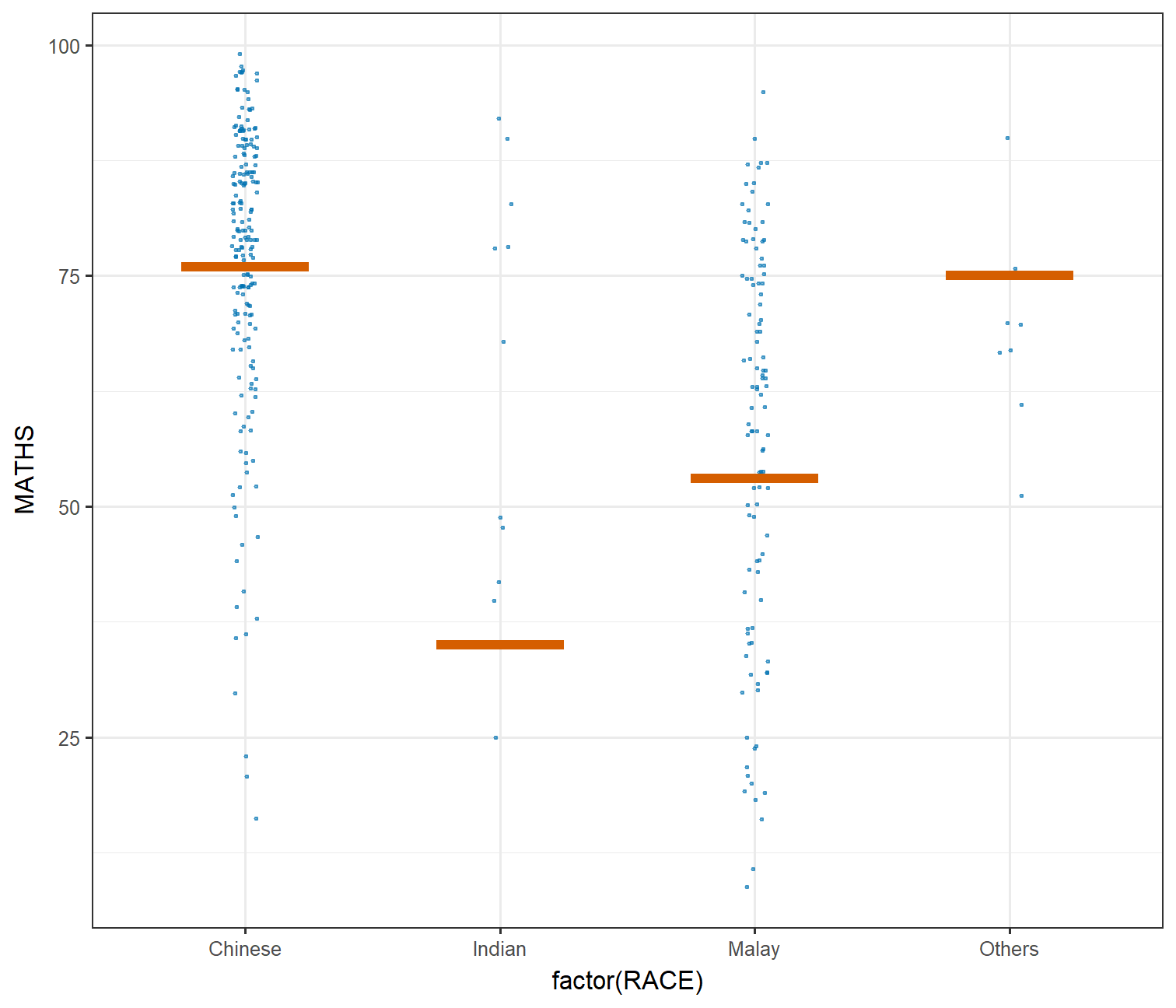<!-- --> ] --- ## Visualising Uncertainty with Hypothetical Outcome Plots (HOPs) .pull-left[ The code chunk: ```r ggplot(data = exam, (aes(x = factor(RACE), y = MATHS))) + geom_point(position = position_jitter( height = 0.3, width = 0.05), size = 0.4, color = "#0072B2", alpha = 1/2) + geom_hpline(data = sampler(25, group = RACE), height = 0.6, color = "#D55E00") + theme_bw() + transition_states(.draw, 1, 3) ``` ]