class: center, middle, inverse, title-slide # Lesson 2: Designing Graphs to Enlighten: Principles and Best Practices ### Dr. Kam Tin Seong<br/>Assoc. Professor of Information Systems ### School of Information Systems,<br/>Singapore Management University ### 2019-04-28 (updated: 2022-04-21) --- # What will you learn from this lesson? .vlarge[ - Data visualisation design process - The Devil is in the data - Human perception and information processing - Components of a graph - Principles and practical guides for data visualisation design - Data visualisation critics framework ] ??? In this lesson, I am going to share with you the basic principles and best practices of Data Visualisation Design. The discussion consists of five sections. First, I will provide an overview of data visualisation design process. Next, by using appropriate examples, I will share with you the importance of data selection and preparation in building enlightening graphs. In section three, the principles of visual perception will be introduce. In section four, the practical guides of data visualisation design will be discussed. Lastly, a framework for evaluating and criticising data visualisation design will be introduced. --- ## Building Block of Visual Analytics .center[  ] ??? This slide shows the building block of visual analytics. Today, we will focus our attention on the lower left corner of the building block, namely Visual Perception. --- # Data visualisation design process .vlarge[ - Start with a clear message - Select the right data - Use the right visualisations - Express and explain - Review and seek feedback from experts and casual readers ] ??? In general, a data visualisation design process consists of five major steps. --- # DataViz design process: Start with a clear message .center[  ] ??? In data visualisation design, it is important to be clear and explicit about what you want to achieve. Is it to explore some data, to convey an inferential analysis, to deliver a message, convince an audience, or support a decision? It may be a mixture of these—for example, even seemingly simple exploratory plots should serve some (perhaps implicit) decision (e.g., on how to explore further). Every graph, and, more generally, every communication, must be tailored to its specific purpose. --- # The Devil is in the Data  ??? Clean and tidy data are needed to build truthful data visualisation. But beside clean and tidy data, there are at least two considerations related to data require our attention. --- ## Numbers Worth Knowing .vlarge[ + Not all numerical data are continuous!] .center[  ] ??? First, it is important to note that not all numerical data are continuous. There are two types of numerical data. They are discrete and continuous. Discrete data can only assume specific values that you cannot subdivide. Typically, you count discrete values, and the results are in frequency count or in per cent . For example, display size should be classified as discrete (i.e. nominal or ordinal scales) instead of continuous., a mean of 15.81 in monitor is no meaning. Continuous data can assume any numeric value and can be meaningfully split into smaller parts. Consequently, they have valid fractional and decimal values. In fact, continuous variables have an infinite number of potential values between any two points. Generally, you measure them using a scale. --- ## Visualising the Right Data .vlarge[ + There are more than one way to present the data. ] .center[  ] ??? Secondly, there are more than one way to present the data. It is not unusual by presenting derived data reveal more aha surprises than the raw data. --- ## Visualising the Right Data .large[ + Derived values reveal more interesting patterns than absolute values. ] .pull-left[  ] -- .pull-right[  ] ??? The data visualisation on the left is a dual y-axis bar graph. The y-axis on the left shows revenue and the y-axis on right shows customers. From the graph, you can see how both the monthly revenue and number of customers are growing for this company. The data visualisation on the right shows the differences between the month-to-month % change of revenue and customers. By showing the data in percent change, the data visualisation allows us to discover that the month-to-month customers and revenue growth rate are reducing in the financial year. --- ## Visualising the Right Data .large[ + Derived values reveal more interesting patterns than absolute values. ] .center[  ] ??? By deriving revenue per customer and plot them as a line graph, the data visualisation allows us to tell a more compelling data story. In the figure, we can see that revenue per customer has decreased significantly during the year, even though the monthly revenue has risen steadily. The important take away from this case study is that select the right data to prepare the data visualisation and be mindful that the raw data might not always be the right choice. --- ## Graphical Integrity: Show Me the Truth .center[  .small[ Source: [Department of Statistics](https://www.singstat.gov.sg/modules/infographics/singapore-international-trade) ]] ??? Let us take a good look at the data visualisation on the slide. Can you spot any graphical integrity issue? Yes, the issue of inconsistent data aggregation. On the figure, the major trading partners are at the country level except EU. --- ## Graphical Integrity: Show Me the Truth .large[ - Snapshot can be misleading!] .pull-left[  ] -- .pull-right[  ] .small[ Source: Cairo, Alberto (2019) **How Charts Lie**, W.W. Norton & Company, USA. pg 168. ] ??? Donald Trump liked to claim that the job market was a "disaster" before he was sworn in but recovered right after, and he used charts that cropped the horizontal axis in a convenient place. But if we go back in time and mark the point when Trump became president, we'll see that there's no remarkable change in the trajectory and slope of the line. Jobs began recovering in 2010. --- ## Graphical Integrity: Show Me the Truth .vlarge[ - Do not miss-out what had happened in between.] .pull-left[  ] -- .pull-right[  ] --- # Human Perception and Information Processing .center[  ] --- ## Pre-attentive Processing .vlarge[ - A limited set of visual properties are processed preattentively (without need for focusing attention). - This is important for design of visualizations - What can be perceived immediately? - Which properties are good discriminators? - What can mislead viewers? ] --- ## How Visual Sensing Works? .vlarge[Fact 1: We see what we know and expect.] .center[ ] --- ## How Visual Sensing Works? .vlarge[Fact 2: We do not attend to everything we see.] .center[  ] --- ## How Visual Sensing Works? .vlarge[Fact 3: We don’t remember everything we see] .center[  ] --- ## How Visual Sensing Works? .vlarge[Fact 3: We don’t remember everything we see] .center[  ] --- ## How Visual Sensing Works? .vlarge[How Many 3’s?]  --- ## How Visual Sensing Works? .vlarge[Now you see them!]  ??? As you can see, by applying pre-attentive principle, we can count the number 3 easily now. --- ## Application of pre-attentive principle in data visualisation design .pull-left[  ] .pull-right[  ] ??? In last Saturday class, I had shown the reference line feature of Tableau. By understanding the principle of pre-attentive, reference line feature is useful for providing context to the data visualisation. --- ## Application of pre-attentive principle in data visualisation design .pull-left[  ] .pull-right[ 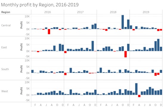 ] ??? In the data visualisation of the right, bright red is use to show the month running at a lot. This is another example whereby pre-attentive principle is put go used. --- # Components of a graph .center[  ] --- ## Bertin’s Semiology of graphics .center[ 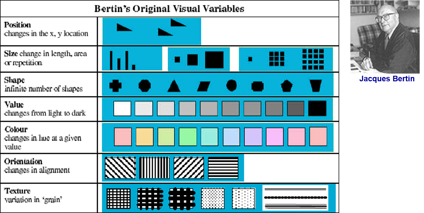 ] --- ## Choosing the Right Visualisation .center[ 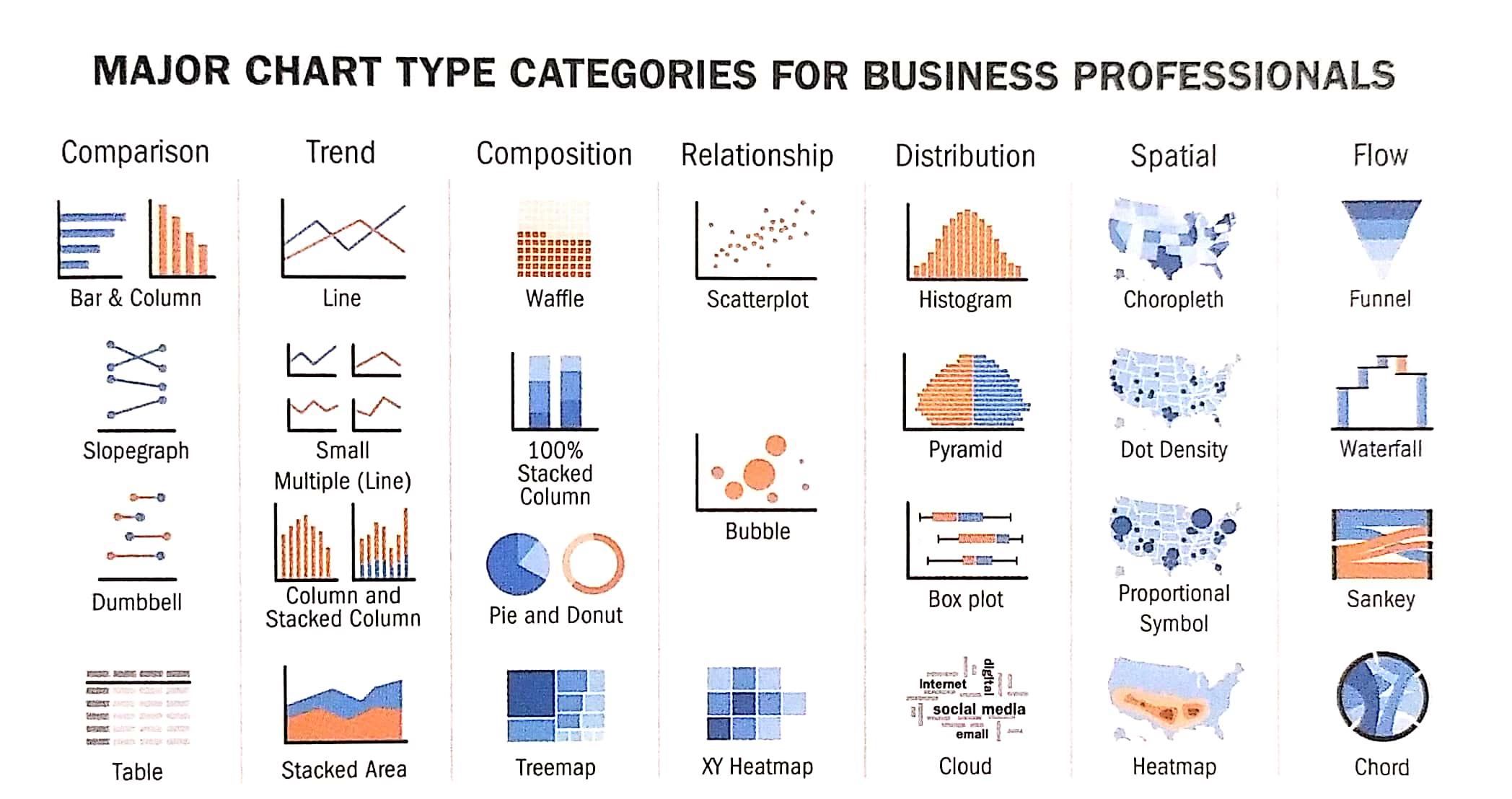 ] --- # Design principles for effective visual presentation .vlarge[ * Guides for Encoding Values in Graph * JunkCharts * Practical Guides for Using Colour in Charts * Data-ink ] --- # Design principles for effective visual presentation .vlarge[ - **Guides for Encoding Values in Graph** - JunkCharts - Practical Guides for Using Colour in Charts - Data-ink ] --- ## General Guide: Show the Data Clearly  ??? The pie and donut charts in panels (a) and (b) make it difficult to see the order of magnitude of some of the segments. The eye needs to compare areas, bent lengths (of the contour), or angles, – graphical attributes that are not easily decoded. The donut chart even omits the angles. The mosaic plot in panel (c) only relies on areas; again, it is hard to tell the order of magnitude. It is better to use lengths with a common baseline or positions on a common scale, such as in a bar chart or dot plot (see Cleveland-McGill effectiveness ranking in Law 3). The bar chart in panel (d), however, introduces a fake dimension, which is unnecessary and makes it hard to decode the numerical values from the height of the bars. Panels (e) and (f) are appropriately simple and show the data clearly. They also order the data by magnitude to aid comparison even further. The dot plot in panel (f) uses minimal amount of ink and draws the eye to the position of the dots; it is the most effective way of displaying these data. --- ## Guides for Encoding Values in Graph .vlarge[ Guide 1: Avoid using point alone to display time-series data] .center[  ] --- ## Guides for Encoding Values in Graph .vlarge[ Guide 2: Avoid using points to represent discrete values] .center[  ] --- ## Guides for Encoding Values in Graph .vlarge[ Guide 3: Bars don’t work unless the quantative scale begins at zero] .center[  ] --- ## Guide for Encoding Values in Graph .vlarge[ Guide 4: Avoid pie chart if possible because our eyes are not good in reading areas] .center[  ] .small[ Reference: http://junkcharts.typepad.com/junk_charts/2015/09/a-not-so-satisfying-rose.html] --- ## Guide for Encoding Values in Graph .vlarge[ Guide 5: Avoid pie chart if you are comparing changes over time] .pull-left[  ] .pull-right[  ] --- # Design principles for effective visual presentation .vlarge[ * Guides for Encoding Values in Graph * **Chartjunk** * Practical Guides for Using Colour in Charts * Data-ink ] ??? Chartjunk refers to all visual elements in charts and graphs that are not necessary to comprehend the information represented on the graph, or that distract the viewer from this information. It was first introduced by Edward Tufte in his 1983 book *The Visual Display of Quantitative Information*. There is an interesting blog called Junk Charts by Kaiser Fung. The blog link is available on the last slide. --- ## ChartJunk I .vlarge[ - Avoid using unnecessary colour shading for the bar] .center[  ] ??? In this data visualisation, it is very obvious that the different intensity colours shading used on the bars and background are not map to any meaningful variables. These are junk that should be avoid in our graphs. --- ## ChartJunk II .vlarge[ Avoid colourful or wallpaper background] .center[  ] ??? In this data visualisation, the background patterns make it impossible for us to read the words in the legend. Likewise the watermarks used as the background of the graph is redudant. Again, these are junk that we should be avoided. --- ## ChartJunk III .vlarge[ Avoid using 3D effects in graphics]  ??? It is very common for us to see 3D bar chart was used to present frequency distribution of a categorical variable like the data visualisation on the left of the slide. In fact, the fancy 3D bar chart is less effective to read as compared to the simple bar chart on the right of the slide. The key take away is avoid using 3D object to display univariate data. --- ## ChartJunk IV .vlarge[ Avoid using misleading graphical representation] .center[  ] ??? In this data visualisation, there is no way for us to know what is the sales volume represented by one potato because their ratio varies from one year to another. --- ## ChartJunk V .vlarge[ Avoid using artistic design which is difficult to visualise] .center[ ] ??? Although the visualisation is very appealing visually. However, it is not functional because the curve 3D bar chart make it very difficult to do a proper comparison. --- ## ChartJunk VI .vlarge[Designing graph to enlighten people – not to entertain them ] .center[  ] ??? This is another good example of JunkChart. In this data visualisation, the author distorts the sequence of the age-cohort intentionally in order to show the ladder-like view. But this design easily lead to misinterpretation by the graph users. --- # Design principles for effective visual presentation .vlarge[ * Guides for Encoding Values in Graph * JunkCharts * **Practical Guides for Using Colour in Charts** * Data-ink ] ??? In this topic, I am going to share with the practical guides for using colour in data visualisation. --- ## Practical Guides for Using Colour in Charts .vlarge[ Guide 1: If you want different objects of the same colour in a graph to look the same, make sure that the background- the colour that surrounds them – is consistent.] .center[  ] ??? The guide practice If you want different objects of the same colour in a graph to look the same, make sure that the background- the colour that surrounds them – is consistent. We should avoid using background with different colour intensity. --- ## Practical Guides for Using Colour in Charts .vlarge[ Guide 2: If you want objects in a graph to be easily seen, use a background colour that constrasts sufficiently with the object.] .center[ ] --- ## Practical Guides for Using Colour in Charts .vlarge[ Guide 3: Use color only when needed to serve a particular communication goal.] .center[ ] ??? The power of preattentive processing. --- ## Practical Guides for Using Colour in Charts .vlarge[ Guide 4: Use different colours when they correspond to differences of meaning in the data.] .center[  ] --- ## Practical Guides for Using Colour in Charts .vlarge[ Guide 5: Use soft, natural colours to display most information and bright and/or dark colours to highlight information that requires greater attention.] .center[ ] --- ## Practical Guides for Using Colour in Charts .large[ Guide 6: When using colour to encode a sequential range of quantitative values, stick with a single hue (or a small set of closely related hues) and vary intensity from pale colours for low values to increasingly darker and brighter colours for high values.] .center[ ] --- ## Practical Guides for Using Colour in Charts .vlarge[ Guide 7: Non-data components of a graph should be displayed just visibly enough to perform their role, but not more so, for excessive salience could cause them to distract attention from the data.] .center[ ] --- ## Practical Guides for Using Colour in Charts .vlarge[ Guide 8: To guarantee that most people who are colourblind can distinguish groups of data that are colour coded, avoid using a combination of red and green in the same display.] .center[ ] --- # Design principles for effective visual presentation .vlarge[ * Guides for Encoding Values in Graph * JunkCharts * Practical Guides for Using Colour in Charts * **Data-ink** ] --- # Data-ink .pull-left[ .vlarge[ - Reduce the non data-ink - Removed unnecessary non data-ink - De-emphasise or regularise the remaining non data-ink - Enhance the data-ink - Remove unnecessary data-ink - Emphasise the remaining data-ink ]] .pull-right[ ] ??? The term, ‘data-ink’, is defined as the total ink on a graph that represents data. Tufte claims that good graphical representations maximize data-ink and erase as much non-data-ink as possible. Thus, he defines the data-ink ratio is the proportion of a graphic’s ink devoted to the non-redundant display of data-information. It should equal to (1 - the proportion of graphics that can be erased without loss of data-information). --- ## Practical used of data-ink ### Shouting to emphasize what’s interesting .center[ ] --- ## What should the relative lengths of the axis be? .large[ - Should not manipulate the aspect ratio to intentionally exaggerate or downplay the rate of change. - Stick to the convention of making your graphs wider than being tall.] .center[ ] --- ## When can you eliminate tick mark? ### Tick marks are superfluous on categorical scale. .center[ ] --- ## When you shouldn’t eliminate tick mark? ### Tick marks are necessary on continuous scale. .center[ ] --- ## How many tick marks should you use? .vlarge[ - There is no exact number that works best in all circumstances, and the size of the graph is a factor that must considered: the longer the scale line, the more tick marks it should contain.] .center[ ] --- ## When can you eliminate legends? .pull-left[ .vlarge[ - In this graph, a legend is used to indicate product types.] ] .pull-right[ .vlarge[ - In this graph, product types are labeled directly. ]  ] --- ## An enligthening data visualisation will be incomplete without a well worded title .center[  ] .small[ Source: [The truth about weekend working](https://www.ft.com/content/085749dc-3cac-11ea-b232-000f4477fbca), Financail Times, January 23 2020.] - More example can be found [here](https://www.ft.com/graphics) --- ## Using Annotation to tell data story .center[  ] .small[ Source: [The truth about weekend working](https://www.ft.com/content/085749dc-3cac-11ea-b232-000f4477fbca), Financail Times, January 23 2020.] --- ## Graphical Integrity: Show Me the Truth .large[ - However, don't lie to yourself (or to others) with charts] .center[  ] --- # Graph typography ### Avoid using artistic fonts .center[ ] --- ## Graph Labeling ### Orientation of label should be reader friendly .center[ ] --- # Three Bugs of Charts Interpretation .vlarge[ - The **Patternicity** bug: We detect interating patterns, regardless of whether or not they are real. - The **Storytelling** bug: We immediately come up with a coherent explanation for those patterns. - The **Confirmation** bug: We start seeing all further information we receive, even the one that conflicts with our explanation, in a way that confirmed it. We refuse to give our explanation up, no matter what. ] --- ## Three Bugs example  .small[ Source: [Spurious Correlation](https://www.tylervigen.com/spurious-correlations) ] --- ## Stop the Fallacy of Visual Storytelling  .small[ Source: [Franz H. Messerli (2012)Chocolate Consumption, Cognitive Function, and Nobel Laureates](https://www.nejm.org/doi/full/10.1056/NEJMon1211064), *The New England Journal of Medicine*. ] --- # Data Visualization: Clarity or Aesthetics? .pull-left[ 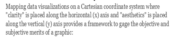 ] .pull-right[ 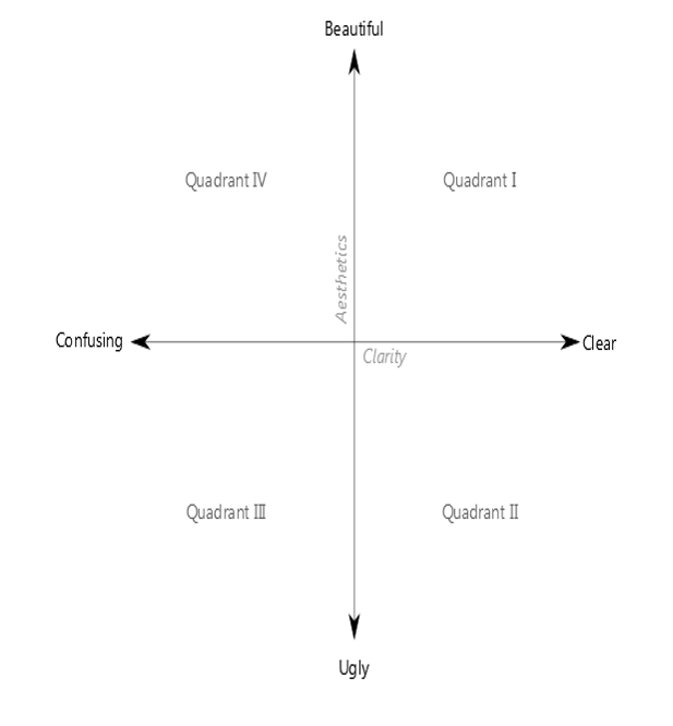 ] .small[Source: http://dataremixed.com/2012/05/data-visualization-clarity-or-aesthetics/] --- ## A Tale of Four Quadrants .center[ 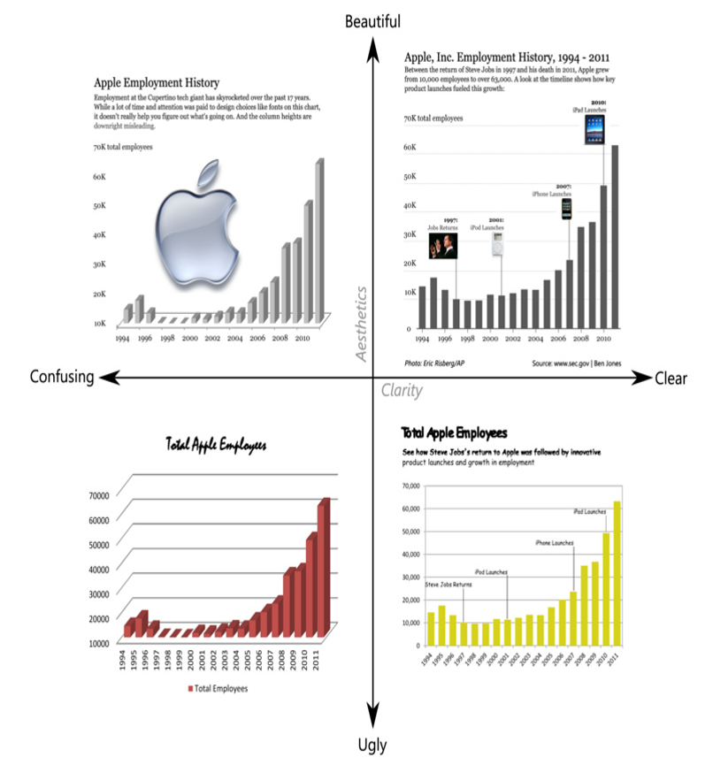] --- ## Quadrant IV – Confusing yet Beautiful .pull-left[ .large[ - Why is it “beautiful”? - Well placed & aligned title & lead-in. - Attention to detail with font selection. - Inclusion of image. - Why is it “confusing”? - Y-axis starts at 10K (column height misleading). - 3D effect makes it difficult to gage heights. - Title & lead-in aren’t helpful. ] ] .pull-right[ 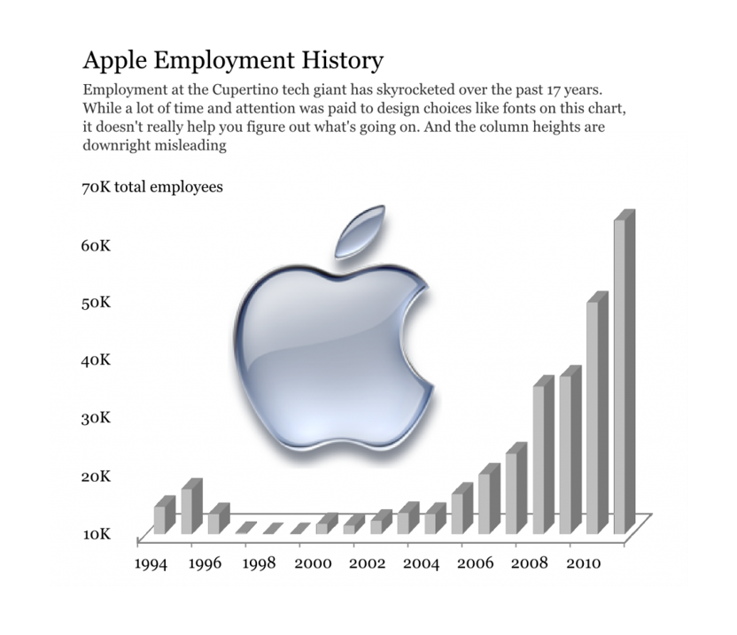] --- ## Quadrant III – Confusing and Ugly .pull-left[ .large[ - Why is it “ugly”? - Horrible font & color choice. - Grid lines are too dark & distracting. - Format of axes (vertical x-axis labels, number format of y-axis). - Why is it “confusing”? - Y-axis starts at 10K (column height misleading). - 3D effect makes it difficult to gage heights. - No lead-in or call-outs to provide context. ]] .pull-right[ ] --- ## Quadrant II – Clear but Ugly .pull-left[ .large[ - Why is it “ugly”? - Poor color (puke yellow?) and font (Comic Sans?) choices. - Slightly pixelated – poor attention to image quality detail. - Chart details – axis orientation, grid lines, outline. - Why is it “clear”? - The y-axis starts at 0 and the 2D columns are easy to gage. - For the first time, we see call-outs of relevant events on the timeline. - This time the lead-in paragraph is actually informative. ]] .pull-right[ ] --- ## Quadrant I – Clear and Beautiful .pull-left[ - Why is it “beautiful”? - Good font & color choices throughout. - Soft gridlines don’t distract. - All elements well aligned and spaced. - High res images are “useful” chartjunk. - Why is it “clear”? - The y-axis starts at 0 and the 2D columns are easy to gage. - Call-outs with images aid cognition. - Improved title & lead-in verbiage provide further elucidation. - For the first time, a photo credit and data source are included. ] .pull-right[ ] --- # References Claus O. Wilke (2019) [Fundamentals of Data Visuaization](https://clauswilke.com/dataviz/). O'Reilly, USA. Few, Stephen (2012) (2nd edition) **Show Me the Numbers: Designing Tables and Graphs to Enlighten**, Analytics Press, Oakland, USA Cairo, Alberto (2019) **How Charts Lie**, W.W. Norton & Company, USA. Robbins, Naomi B. (2005) **Creating More Effective Graphs**, John Wiley & Sons, New Jersey, USA Wong, Dona M. (2010) **The Wall Street Journal Guide to Information Graphics**, W. W. Norton & Company, Inc. New York. Tufte, Edward (2nd Edition) **The Visual Display of Quantitative Information**, Graphics Press LLC, Connecticut, USA. --- # Highly recommended blog .large[ - [The Functional Art](http://www.thefunctionalart.com/) - [Junk Charts](http://junkcharts.typepad.com/junk_charts/) - [Perceptual Edge](http://www.perceptualedge.com/blog/) - [EagerEyes](http://eagereyes.org/) - [Statistical Graphics and more](http://www.theusrus.de/blog/) - [Visualizing data](http://www.visualisingdata.com/) - [Visualizing Economics](http://visualizingeconomics.com/) ]